Del Ryan - Reflections

My name is Del Ryan. I am currently a member of Paul Young's CSC 230 class. I will add posts for this class onto the list of posts from my GDS 108 class taken this past fall.

Sunday, September 24, 2006

"Cut and Paste" to perfection


To demonstrate "cut and paste" technology I thought this picture, which is actually put together from two separate photographs and retouched at the center, offers a very interesting way to look at distance as a curvature of the earth. Obviously with computer assistance and digital retouching the "camera doesn't lie" is a fallacy. Agency: Carl Ally Inc. Copy write: Hertz System, Inc., 1972. This add can be found in The Design of Advertising-1994 by Roy Paul Nelson.
Shopping Anyone?

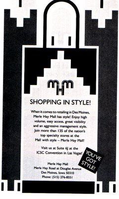
I loved this add because of its use of repeating patterns, something we've been doing with the "Spanish tiles" and unity projects,and the unique way the designer, John Sayles of Sayles Graphic Design, Inc., Des Moines, Iowa incorporates high tech imagery. I felt the MHM logo was truly unique and very attractive. The add ran in Shopping Centers Today to interest potential store to locate in an Iowa mall. (Art director: John Sayles. Copywriter: Mary Langen-Goldstein. This add can be found in The Design of Advertising-1994 by Roy Paul Nelson.

Monday, September 18, 2006

Subliminal Imagery


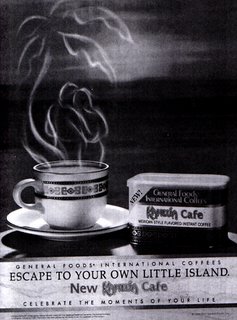
A 1994 add for Kahlua Cafe instant coffee one can see the steam rolling above the coffee forming in image of a man and woman embracing. I imagine Adobe Illustrator w/ layers was used to enhance this photo. The designer is using "subliminal" imagery to gain the interest of the viewer. This add and more information on this type of advertising can be found in Visual Persuation-1997 by Paul Messaris.

Scooter - Our Canine Friend


This blog would not be complete without a picture of our dog, Scooter, who recently showed up in my personal sketchbook.

Buttons and More


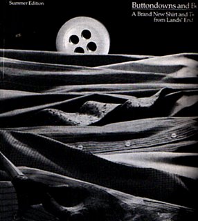
Art director Mike Camusso presents this photographic design for Lands' End's special catolog: "Buttondowns and Beyond." I think the curves and colors used in this illustration demonstrate an effective way for the design elements of unity, especially proximity and continuation, to be utilized. The shirts, ties and buttons are in contact with each other and the eloquent way the folds of each fabric are aligned make the picture flow seamlessly. This add can be found in The Design of Advertising-1994 by Roy Paul Nelson.
Thursday, September 07, 2006

Head to the Beach Anyone?

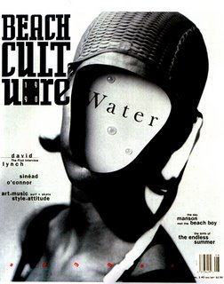
This work is from Beach Culture, 1990. The photo by Geof Kern was originally submitted for inside the magazine, but it made the cover. I really like the black/white composition and the strength it gives to this design. The faceless image leads me to a feeling of fear of the water and the toughness needed to attack it.

Friday, September 01, 2006

AT&T - Your World Delivered

When I first looked at this billboard sign (located a block east of Parkland College) my reaction was this think its design was directly in contrast to the theory implied in my previous post by Carson. After reflecting further, I am not so sure his rule-dissolving style isn't quite apparent in this photograph of the AT&T advertisement. Regardless, I think this is one of the coolest boards I've seen. I look forward to your thoughts on this matter.