Del Ryan - Reflections

My name is Del Ryan. I am currently a member of Paul Young's CSC 230 class. I will add posts for this class onto the list of posts from my GDS 108 class taken this past fall.

Tuesday, October 31, 2006

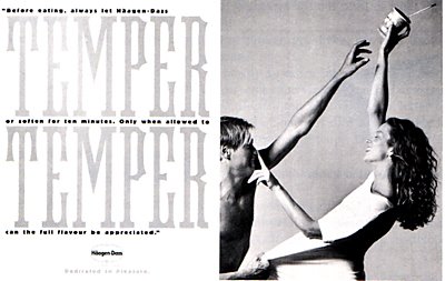
Advertisement from Country Living Magazine(Nov. '06)


This magazine advertisement contains a symmetrical design pattern which is united by proximity of objects. Emphasis is given to this illustration using a contrast in color. Depth is achieved by using shadow.

Peace

This picture came from Creative Jolt Inspirations by Gonella, Anderson and Landa. I liked this illustration because of the design principles of unity by continuation, symmetrical balance, legato rhythm and depth achieved by overlap.

DKNY Catalog


This illustration "dkny catalog" by Trey Lalid in my opinion demonstrates asymmetrical balance, unity by proximity, contrast with the usage of color/shapes of the objects and significant depth w/ various layers of color overlapping the image.

David Carson Book Cover

Carson designed this book cover for his 4th book, Trek (2000). This illustration's chaotic design is good representation of his work. This artist uses the symmetrically balanced text (the word "trek") with an asymmetrical arrangement of colors and shapes. The piece is united by proximity and repetition with a significant amount of overlapping used to provide depth to the layout.

Monday, October 23, 2006

1962 Thriller by Innes

Hammond Innes' Atlantic Fury had this book cover designed by Michael Harvey in 1962. The illustration is an asymmetrical arrangement united by color which uses a contrast in the shape of the two text objects to create a sense of excitement and/or cold.

Too Much Water

Bruce Hamilton's Too Much of Water, 1958 was a series of novels he developed about crime themes. The illustration provided is a book jacket designed by "HW" specifically for this title. This asymmetric designed book cover uses emphasis by isolation, shape and direction and is unifed by proximity. This information was obtained from Front Cover - Great Book Jacket and Cover Design by Alan Powers 2001, p. 88.

Monday, October 16, 2006

Light Anyone???


This image came from Jim Krause's book, Idea Index, 1962. I like the way Jim uses contrasting colors and size to give balance and emphasis to his picture. I know Camille, it's black and white! ;-)

Monday, October 09, 2006

Theme and Art Work Converge


The "tight art" illustrated by this computer generated add uses bold and stylized art to showcase the headline and logo for Mexicana Airlines. I like the way the designed tied their "few steps away" theme into the drawing of the steps entering the plane. Art director: John Coll. Designers: John Scott MacDaniels and John Coll. This add can be found in The Design of Advertising-1994 by Roy Paul Nelson.

Violating Reality

This photo is a Saab ad from the 1980's where two distinct objects are blended together without actually morphing them together. The photograph and topic of violating reality can be found in the book Visual Persuaion - 1997 by Paul Messaris.

Monday, October 02, 2006

"Dedicated to Pleasure"


Within their them "Dedicated to Pleasure," Haagen Dazs ran a series of photographic adds make their ice cream standout in weekend newspaper publications in England. I like the way the design of this add uses different levels of gray to heighten the viewers interest (check out the use of fonts). Credit for this publication goes to the following: Agency: Bartle Bogle Hegarty, London. Art direttor: Rooney Carruthers. Copywriter: Larry Barker. Photographer: Barry Lategan. This add can be found in The Design of Advertising-1994 by Roy Paul Nelson.

Do You Get the Picture?


This add which spanned two pages with Toshiba "introducing television for people whose sense of hearing is as finely tuned as their sense of sight" highlights the importance of using the design principles of balance, proportion, sequence, unity, and emphasis. I particularly like the way designers used white space and element positioning to utilize the appropriate design area. This add can be found in The Design of Advertising-1994 by Roy Paul Nelson. The agency: Calet, Hirsch & Spector, Inc. Art director: Gordon Bennett and Steve Lansberg. Copywriter: Steve Lansberg.